There’s an R package for that!
There are over 15.000 packages on CRAN, the R package repository, and many more on GitHub and other places. Some will make your life easier, some will make you scratch your head in wonder. In this series of blog posts we have a look around the R package ecosystem. Each episode highlights another package, demonstrating the power of R and its amazing community.
Mind the Gap!
If you want to add a gap to a figure’s axis, you are probably looking for one of three things:
- Capped axes — Look good when using continuous variables that don’t start at 0.
- Bracketed axes — Look nice when plotting discrete variables.
- Discontinuous axes — Good for showing outliers without squishing all other data.
Capped axis
Here’s a simple plot, using ggplot and theme_classic()
1library(tidyverse)23if(!require(gapminder)) install.packages("gapminder")4data(gapminder, package = "gapminder")56df <- gapminder %>%7 filter(continent == "Europe", year == 2007)89p <- df %>%10 ggplot(aes(gdpPercap, lifeExp)) +11 geom_point() +12 labs(13 x = "GDP per capita",14 y = "Life Expextancy (years)",15 title = "Average Life Expectancy in European countries, 2007",16 subtitle = "source: Gapminder data"17 ) +18 theme_classic()1920p
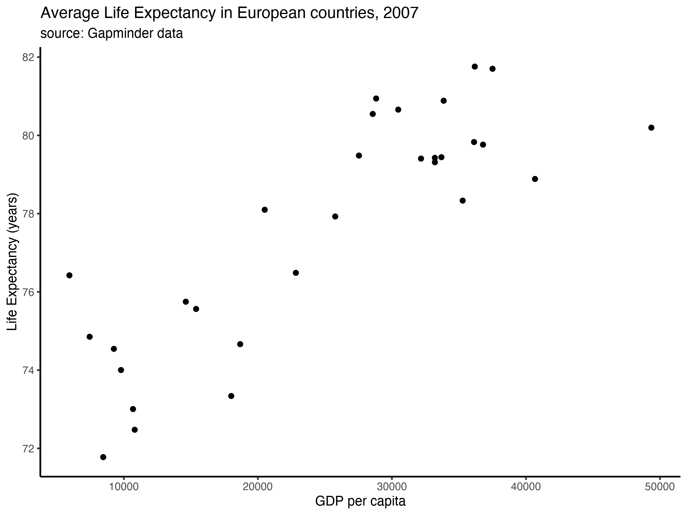
I’d argue that the joint axis lines at the origin (i.e., in the corner on the bottom left) are not great: The two scales (GDP and Life Expectancy) are measured in very different units, and the values do not include zero. Indeed, the fact that the values are far from zero already tells us something about life in Europe, so why don’t we highlight this more?
Unfortunately, ggplot does not come with a theme where the axis lines are not joined at the origin. Luckily for us, there’s lemon — “a package to freshen up your ggplots!”. Here’s how it works:
1if(!require(lemon)) install.packages("lemon")2library(lemon)34p + lemon::coord_capped_cart(bottom = 'both', left = 'both')
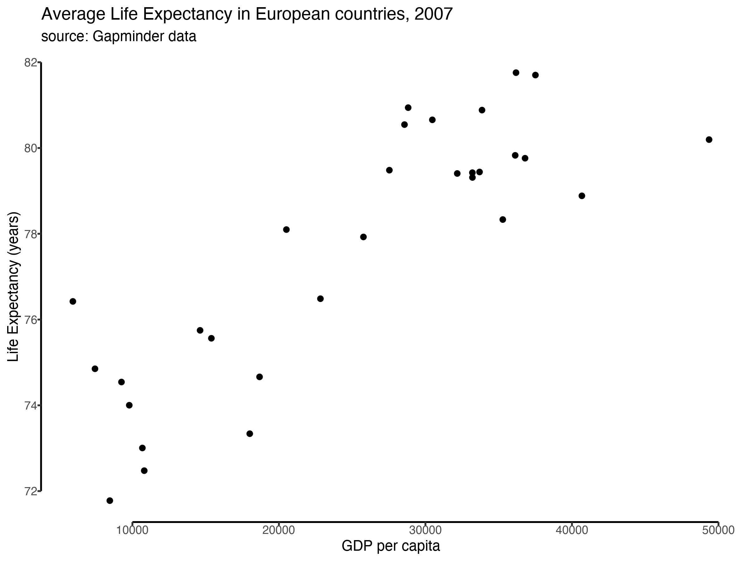
By default, the axes may be capped at a weird point. For more control, you can specify the axis ticks manually:
1p +2 lemon::coord_capped_cart(bottom = 'both', left = 'both') +3 scale_x_continuous(4 breaks = seq(5000, 50000, 5000),5 labels = scales::label_number_si()6 )

Note: You have to get rid of the panel border and axis lines to see the effect. If you are not using theme_classic() this can be achieved by adjusting the theme of the plot like this…
1p +2theme(3 panel.border = element_blank(),4 axis.line = element_line()5)
Bracketed axes
You can also use lemon to make bracketed axes. These look good when you are plotting discrete variables. So instead of this…
1df <- gapminder %>%2 filter(year == 2007)34p <- df %>%5 ggplot(aes(continent, gdpPercap)) +6 geom_jitter(width = 0.15, shape = 1) +7 scale_y_continuous(label = scales::label_number_si()) +8 labs(title = "GDP per Continent, 2007", x = "Continent", y = "GDP per capita") +9 theme_classic()1011p
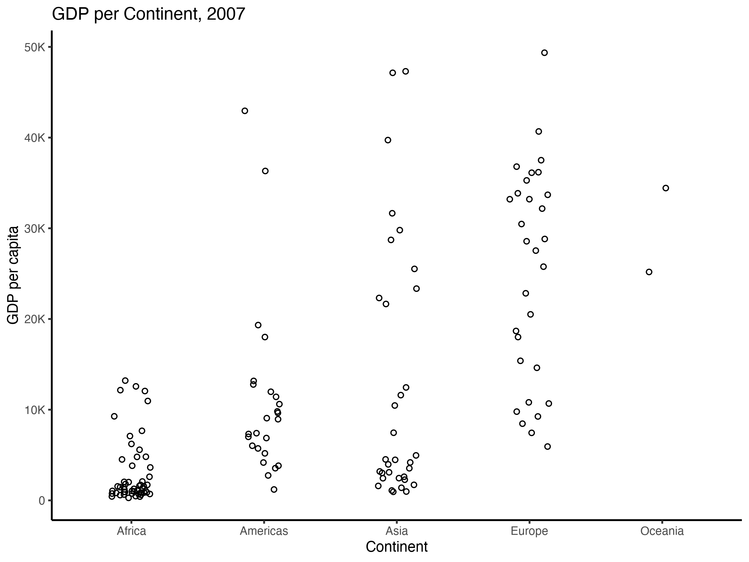
…you get this:
1p +2 lemon::coord_flex_cart(bottom = brackets_horisontal(), left = capped_vertical('both')) +3 theme(4 axis.text.x = element_text(vjust = -1), # the labels are a bit too close to the brackets5 axis.title.x = element_text(vjust = -2)6 )
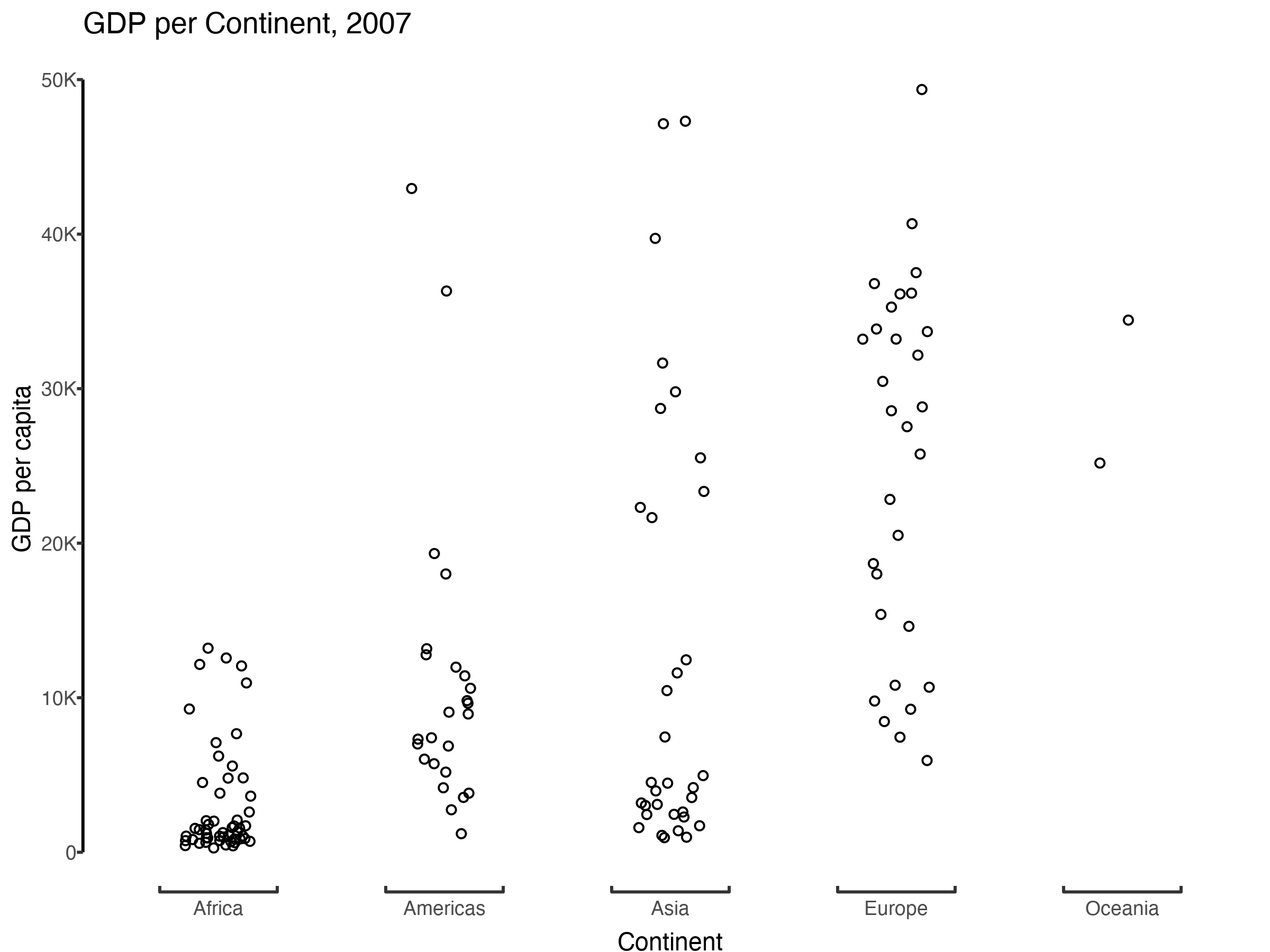
The bracketing helps to emphasise that the variable on the x-axis (continent) is a discrete variable, and to visually separate the jittered points belonging to each continent.
You can learn more about lemon here.
For an alternative solution using ggplot-trickery, see this Stackoverflow answer.
Discontinuous axes
So far we have only removed parts of the axis lines, leaving the data points where they are in the figure. Sometimes we’d like to skip sections of the coordinate system, for example to show outliers without having to squish together all other data points. To demonstrate this, I will add an outlier to the data:
1df <- gapminder %>%2 filter(continent == "Europe", year == 2007) %>%3 add_case(country = "Shangri-La", gdpPercap = 10000, lifeExp = 245)45p <- df %>%6 ggplot(aes(gdpPercap, lifeExp)) +7 geom_point() +8 labs(9 x = "GDP per capita",10 y = "Life Expextancy (years)"11 ) +12 theme_classic()1314p
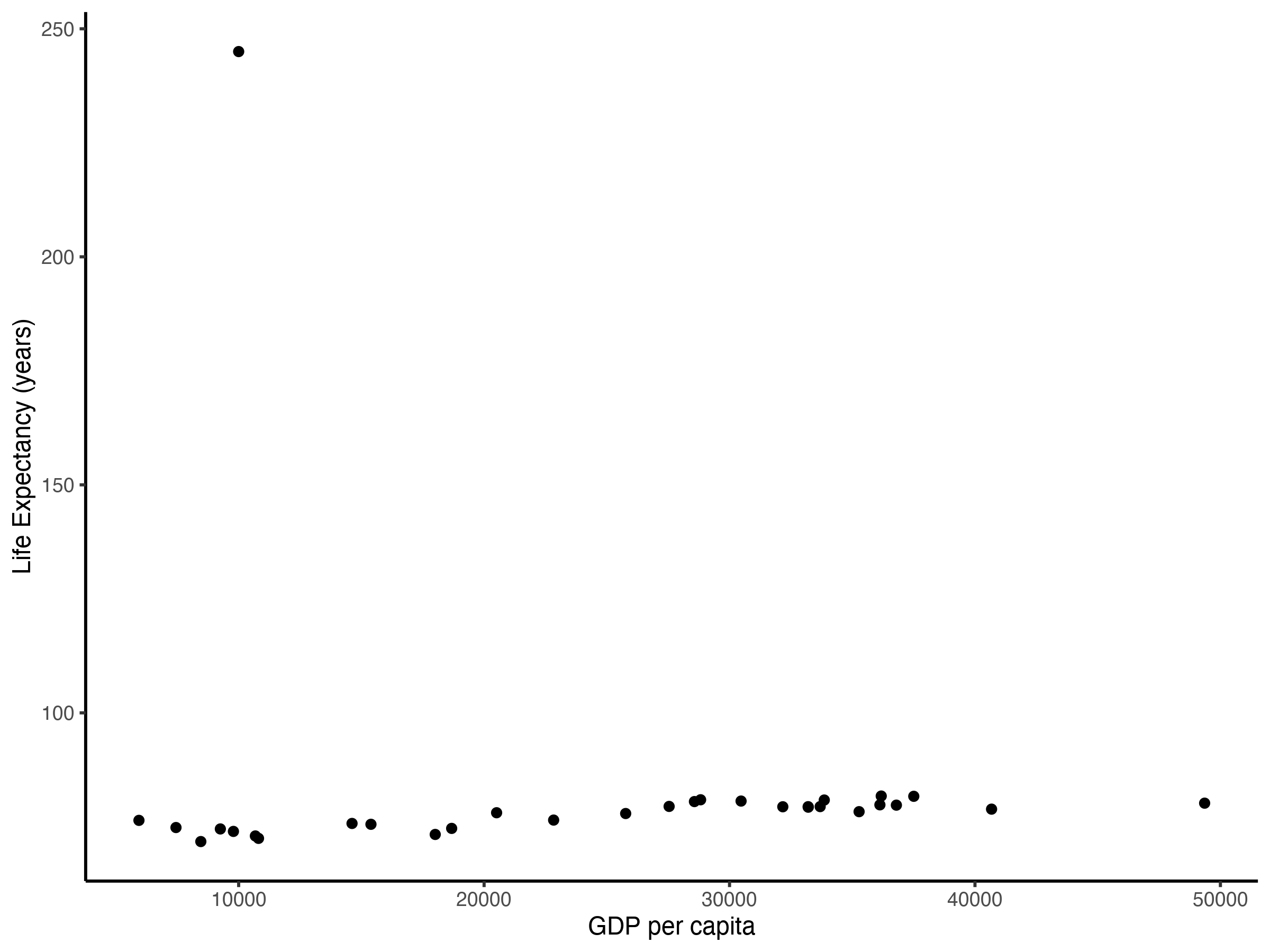
This is bad! The outlier makes it very difficult to tell the difference in life expectancy between all the other data points. In a case like this, a log-transformation can often help to stretch out the data points with lower values while bringing those with higher values closer to them. Here a log-transformation would not help much and it would make the units harder to interpret — log life expectancy in years instead of life expectancy in years.
Instead, it might be better to skip a range of values along the axis. You just have to make sure that the reader understands that this is what you are doing, so you don’t unintentionally mislead them.
To skip a range of values on the y-axis you can use the gg.gap package, which you can find on CRAN and here. It works like this:
1if(!require(gg.gap)) install.packages("gg.gap")2library(gg.gap)34# we need to tweak the theme a bit to make it look nice5# and we need to do it before we pass the plot to gg.gap6p <- p +7 theme(8 panel.background = element_rect(fill = "white"),9 panel.grid = element_blank(),10 axis.line = element_blank()11 )1213p %>%14 gg.gap::gg.gap(15 ylim = c(65, 250),16 segments = list(c(85, 240)),17 tick_width = 5,18 c(0.7,0,0.3)19 )
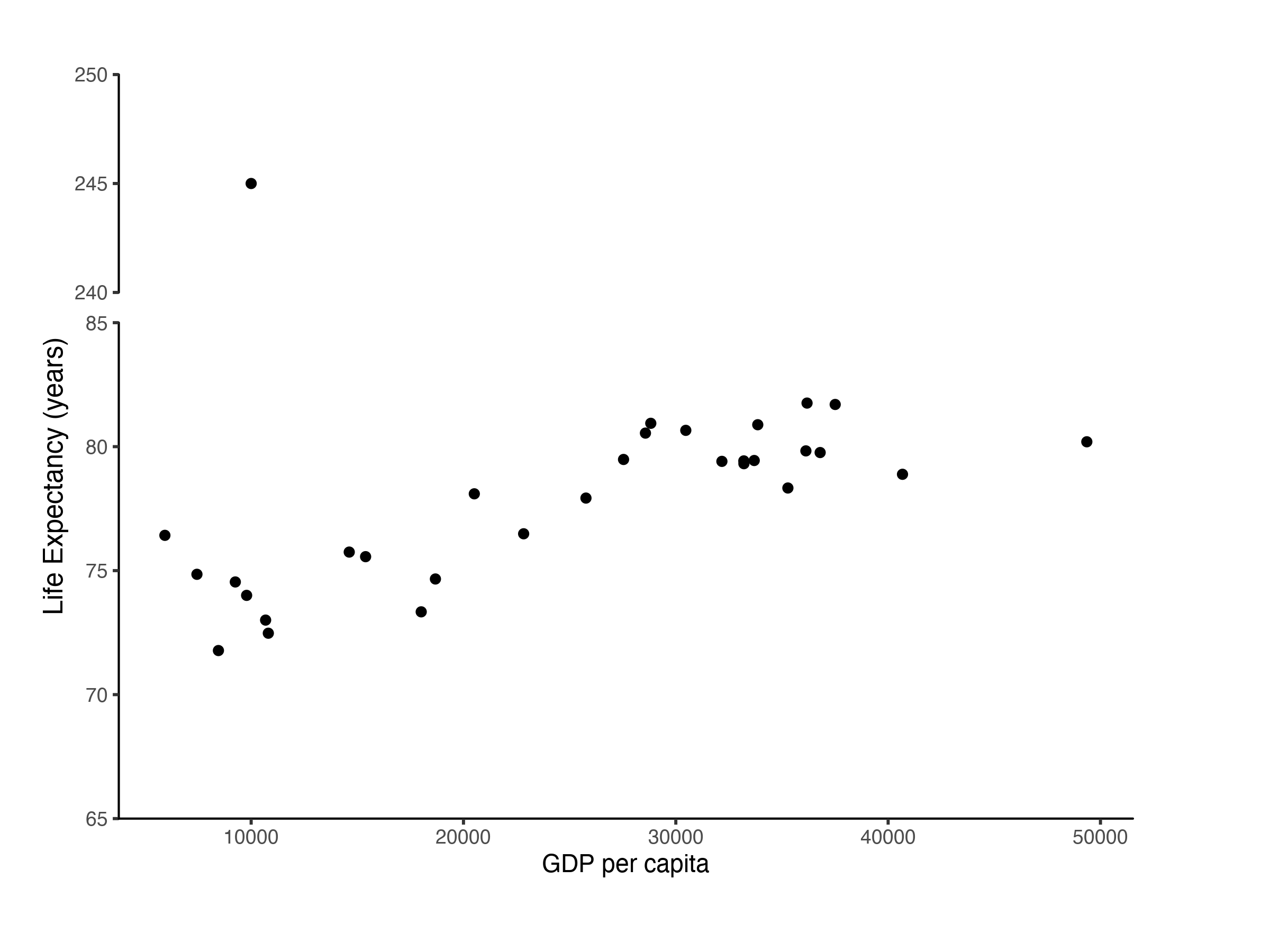
To me, gg.gap feels a bit fiddly and the documentation is not very clear.
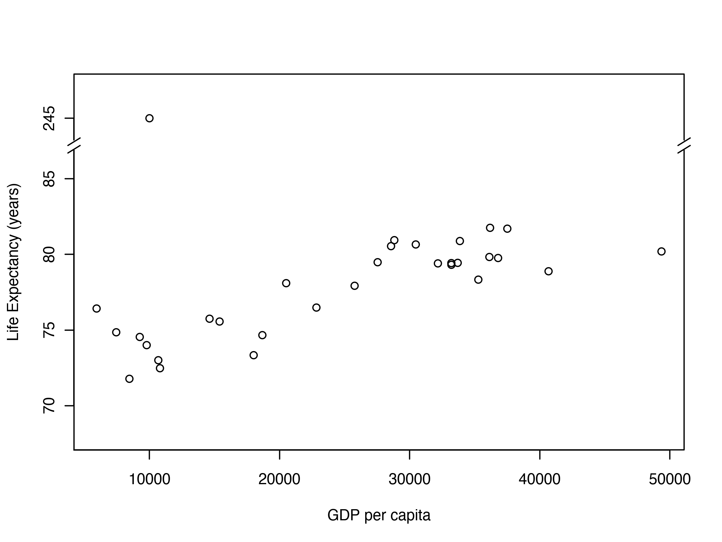
If you don’t mind using base R graphics instead (thus, losing the power of the grammar of graphics), the plotrix package might offer a better alternative:
1if(!require(plotrix)) install.packages("plotrix")2library(plotrix)34plotrix::gap.plot(5 x = df$gdpPercap,6 y = df$lifeExp,7 gap = c(87, 243),8 breakcol = "white",9 xlab = "GDP per capita",10 ylab = "life Expectancy",11 ytics = c(70, 75, 80, 85, 245),12 ylim = c(68, 247)13)1415# decorate the gaps with diagonal slashes16plotrix::axis.break(2, 87.2, breakcol="black", style="slash")17plotrix::axis.break(4, 87.2, breakcol="black", style="slash")
Has this blog post helped you? Do you know other packages that remove things which don’t spark joy? Tell me about it! @drtobilotti